Optimized search with a 27% lift in feature engagement
Project type
Android & iOS
Introduction
Transforming home buying with a digital-first experience
Reali was a real estate and fintech startup on a mission to build a digital-first real estate company with tools and data to drive decision-making while saving customers thousands in commission fees. In 2016 Reali launched and achieved a 10x year-over-year growth, and in 2019, Reali secured $30 million in funding and became a prominent player in real estate in California.
The Reali app provided innovative features that allowed homebuyers to be self-sufficient and practical in their search for a new home. It empowered users to research and visit homes independently, while still offering human interaction when needed. The app allowed users to schedule self-guided tours, place offers, upload documents, and even bid on homes independently within the app.
ThinkSono, a MedTech startup that makes smart ultrasound software, began with a focus on funding, training, and perfecting their machine learning algorithm, the company's secret sauce. Then, with enough traction and success, ThinkSono was ready to move into product development. I was tasked to design the company's first product, AutoDVT.
My role
As the product designer for this project, I was responsible for producing wireframes, user flows, prototypes, motion design specifications, design handoffs, and user testing. I collaborated closely with the design lead, project manager, and a team of five engineers.
The problem
The search experience was full of friction
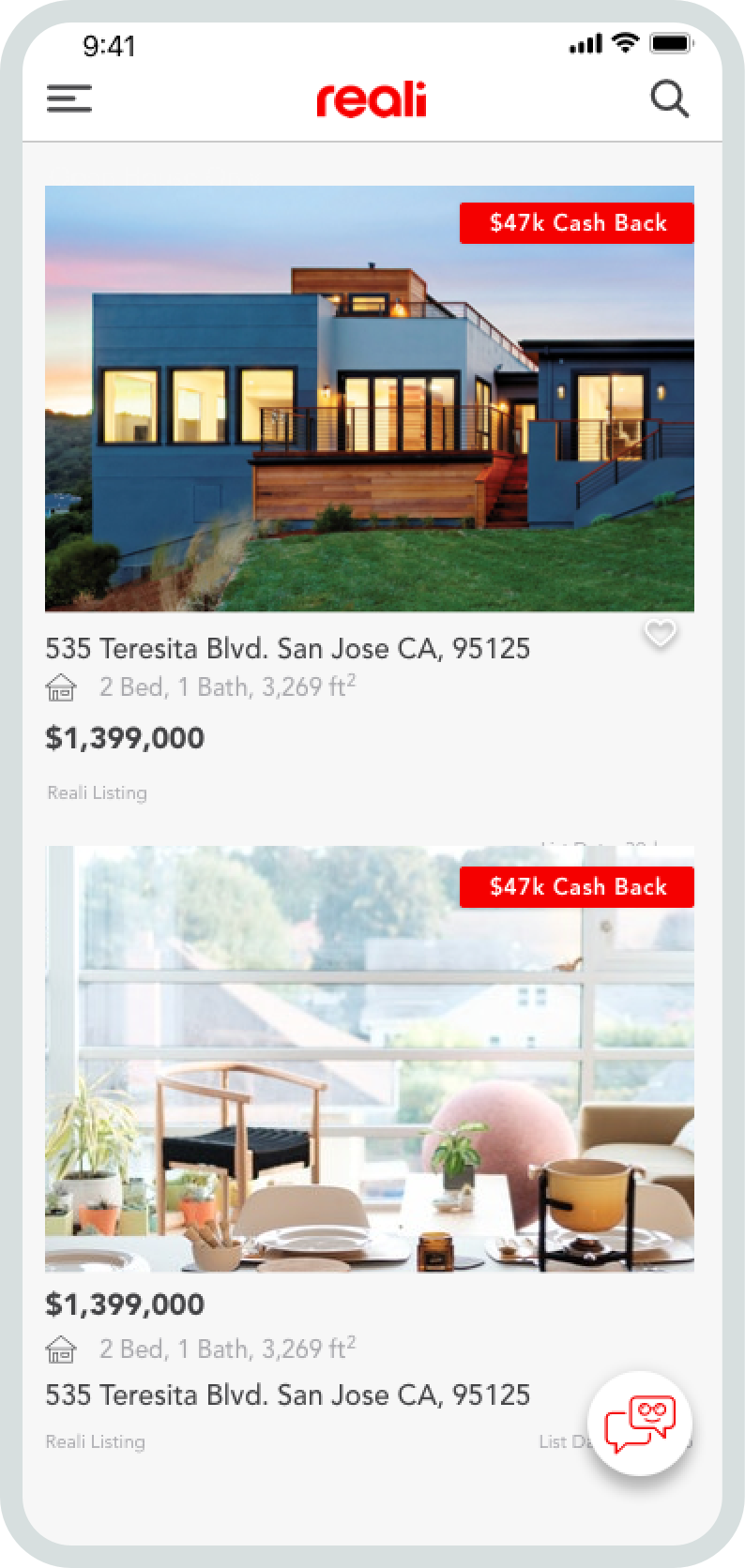
Reali's search feature remained unchanged since the app launched in 2016. This resulted in a poor search experience for some users, who turned to competitors' apps to search for listings. Shockingly, between 15 and 28 percent of these potential buyers never returned to transact with Reali. Here are some of the key issues with search.
Irrelevant defaults
The app suggests irrelevant default search options to users. While this may seem like a minor usability issue, users expressed frustration with having to narrow down their results every time they used the app.
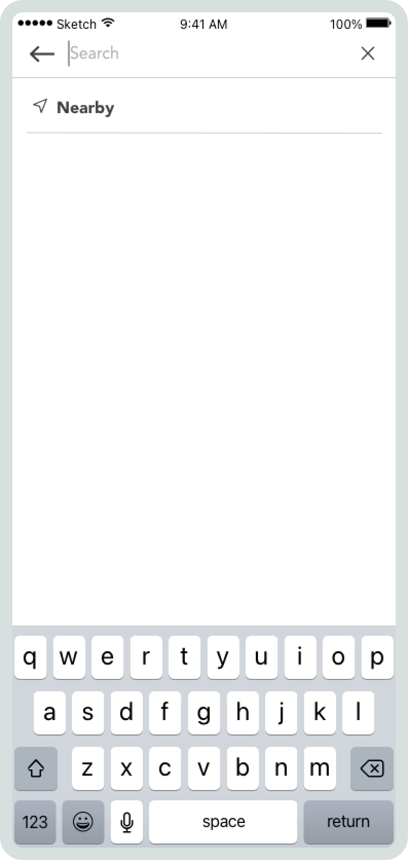
No auto-suggestions
The app offered no auto-suggestions to help users quickly find homes based on search history, current location, or after typing to reduce data input which is particularly important on mobile.
Empty states
When the search returned no results, the app didn't provide context about what was happening and why, but more damaging, it didn't offer any help to recover from it.
Multiple CTA listing details
The listing details screen presents a challenge to users due to excessive call-to-action (CTA) buttons, which unnecessarily complicates the decision-making process and fails to appropriately guide users based on their stage in the repurchasing process.
Research
Our research involved interviews with customer-facing teams and secondary research online.
For this project, we were working with limited resources due to time and budget constraints, as is common in startup environments. Therefore, we took a lean and efficient approach to UX research. Instead of directly interviewing users, we decided to gather insights from sales and real estate agents, who had extensive knowledge about user expectations and pain points. Additionally, I conducted secondary research by exploring competitors' app stores and online forums to gain further insights into what homebuyers were discussing. Below, I have outlined some of the key findings from our research.
• Homebuyers who get verified by uploading financial documents through the app are 73% more likely to place a home offer.
• Price, specs/amenities, affordability, school ratings, and work proximity were determining factors when purchasing.
• First-time buyers who are 45 and older are most likely to distrust a digital-first home-buying experience.
• Potential buyers searched on competitor apps because our app provided minimal discovery tools and a overall was a poor search experience.
Simplifying the number of steps and reducing the cost to get a DVT diagnosis.
Project goals
Increase content relevancy
Improve content relevancy by partnering with the engineering team to build a recommendation engine that automatically shows home buyers the most relevant listings based on their past search behavior, interests, and favorite listings.
Create seamless search experience
Optimize the search process to be quick, effective, and smart. Home buyers searched our app to find an answer. Whether that "answer" is a specific listing or a list of potential homes on the market, they expect to find what they are looking for without friction and with clear next steps.
Mid-fidelity scanning screen exploration
Refining the core screens
After the initial screen design concepts, it became evident that filling all the functionality we contemplated into a single screen was challenging and likely to decrease the learnability of the app. Therefore, I split the content into two screens to make the tasks easier to accomplish and scanning more straightforward.

Final exam PROT screen

Final scan screen
Wireflow
A holistic visual representation of the user flow
With ironed-out key screens, I mapped out a mid-fidelity wireflow to document the entire experience by combining wireframes and flowcharts to show complete views, paths, and interactions between screens.
Wireflows allowed us to have a common understanding of the product structure, supported me in gathering stakeholder feedback, and facilitated design discussions. As a result, Wireflows became an essential living document and were heavily referenced by the engineering team during implementation.
User Testing
Evaluating the design at the different stages
I tested at different stages of the design process. For example, I sometimes tested early to validate or invalidate assumptions before spending engineering time and resources. Still, at other times I would test before a release roll-out to see if specific elements or flows needed improvements. The approach was a mixed bag. It ranged from guerrilla-style testing to more formal in-person testing with relevant participants in the medical space.
We also observed real users interact with the actual product and gather key qualitative insights during clinical trial training sessions with nurses.
Design Library & handoff
Creating a visual language
I created a design library to organize UI components into a single source of truth file to achieve uniformity, speed, and a smoother design handoff. It includes logos, color palette, 60+ UI components, icons, surfaces, typography and stroke styles.
Outcomes
Delivered design on time despite tight deadline
The biggest constraint for the project time because there were commitments with hospitals to begin clinical trials. However, I successfully designed, tested, and handed off the design on time.
AutoDVT in 11 hospitals across Europe
AutoDVT is already live in 7 hospitals in the UK and in discussions to be implemented in further hospitals across Europe, Canada and the United States.
Favorable preliminary results
Preliminary results indicate AutoDVT to be 30x faster than the existing clinical pathway without sacrificing accuracy.
Established a relationship with ThinkSono
Through my work and collaboration, I gained the team's trust, which led to additional work, such as researching the feasibility of future applications, designing the company's marketing website, and designing the reviewer's android mobile app.
Thanks for scrolling.
I'm open to product design opportunities that deliver meaningful impact.
Get in touch